Chobani launches comprehensive rebrand
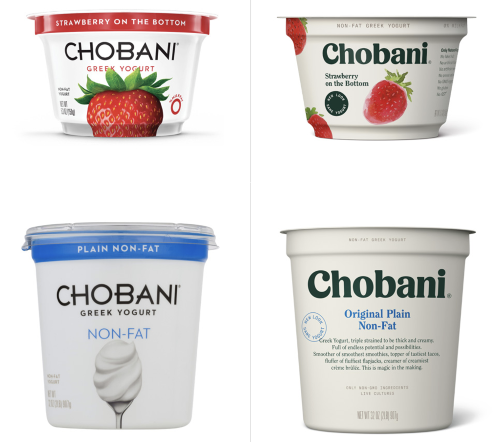
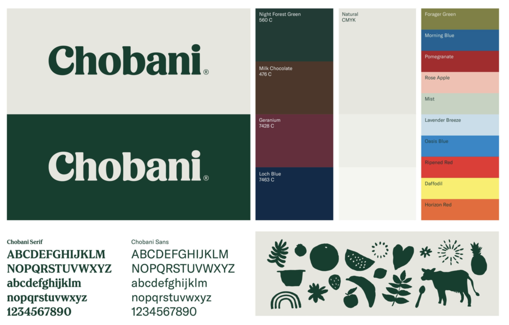
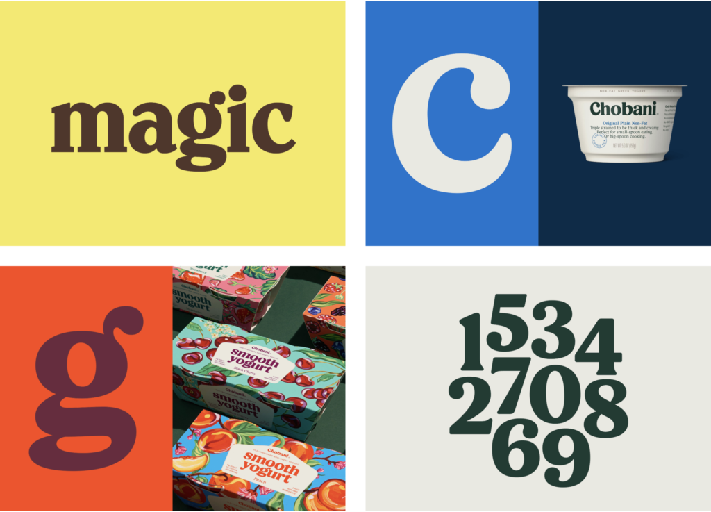
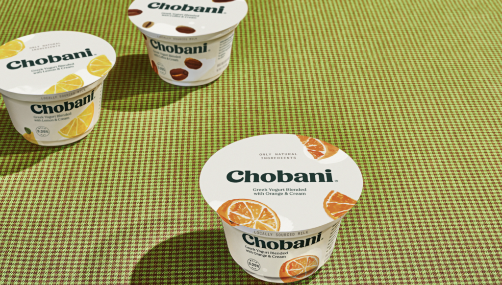
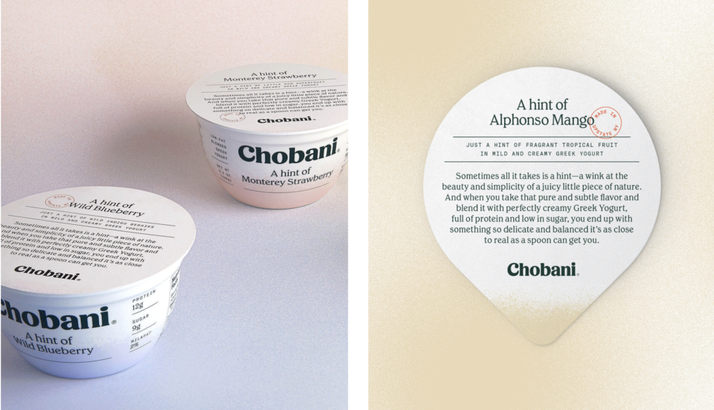
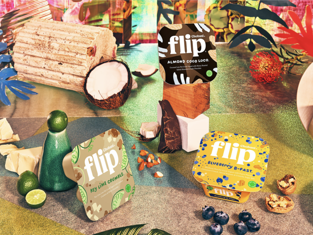
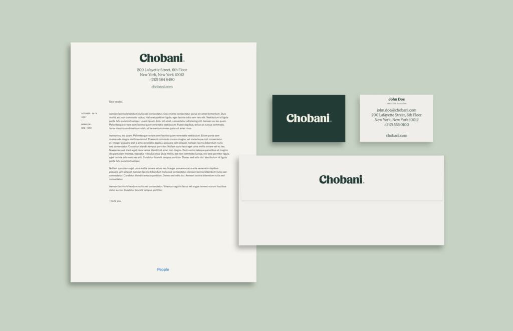
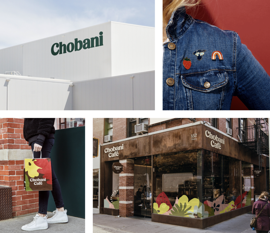
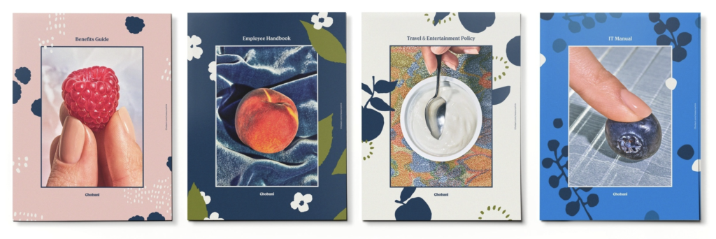
The most dramatic recent rebrand was the rebranding of Chobani. Chobani is a terrific example of a newer brand that clearly differentiated itself from the leaders, built trust with the consumer and quickly assumed a leadership position in the category. Wellness is also an obvious guiding force in the new packaging. While Chobani originally defined its identity on being organic and natural, it now was seeking to evoke those ideals in its new packaging, Folk art of the 1800s, hand- painted artwork and color palettes that come from nature became the primary inspiration, with a new serif font that’s softer and heavy on the lower-case letters. Natural ivories, tans, and browns predominate and, most noticeably, the fruit is rendered in a hand-painted style that actually celebrates the natural imperfections of fruit. Warm, friendly and accessible vs. clean and cold. Certainly, a first rate rethinking of the brand that should serve the company well for years to come.

