


YouTube evolves carefully
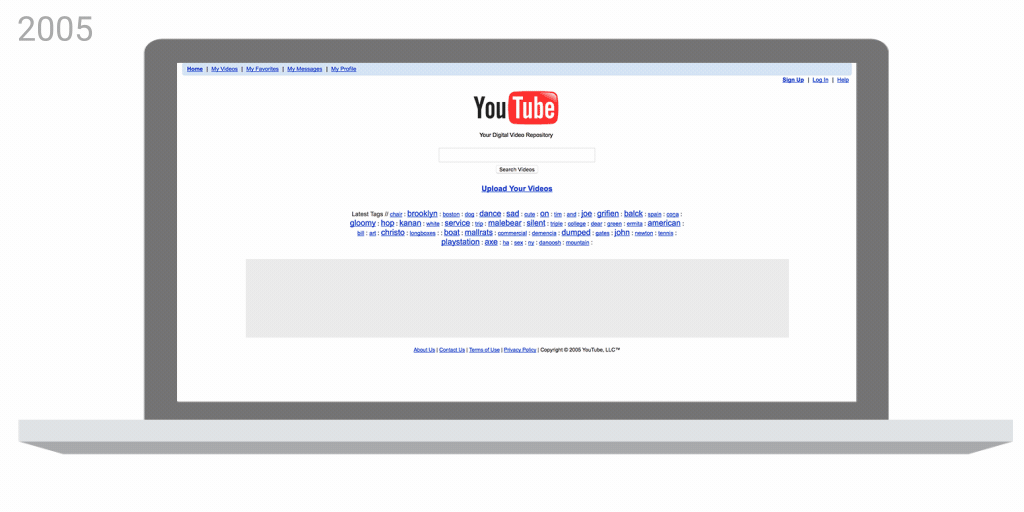
Evolution not revolution. Often in the world of brand identity, this is more the rule rather than the exception. YouTube has recently presented a brand refresh. While is comprehensive including logo, typefaces, color palette and design standards for desktop, mobile and apps, it relies on the existing branding. The logo moves the tube-like box around the word “Tube” and moves it far left becoming a play button. The red is new. The typeface is both new and custom. Major changes to the look, feel, and functionality of its desktop and mobile app are also launching embracing a cleaner, more minimal aesthetic. Adapting the experience to optimally suit the device and context in which people are consuming it was a priority in the overhaul. Given the growth of the video giant, we are confident the evolution will continue, but it is a fascinating ride to watch it change before our eyes. Forward we go…


