

09 01 15
Evolution is almost always a good thing
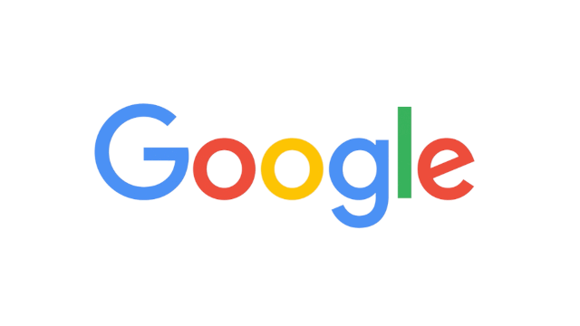
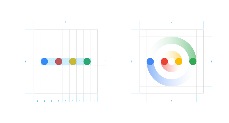
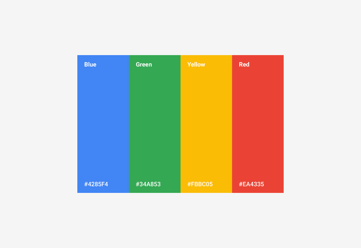
Google introduced its new redesigned logo, September 1, 2015. Same colors, but now in sans serif more scalable typeface and cleverly animated. Four dots now help to communicate to users that something is going on. Hey! All you small devices out there!!!! This is for you…


