

Big tech + design
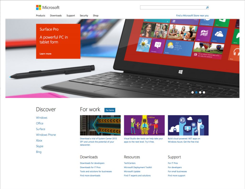
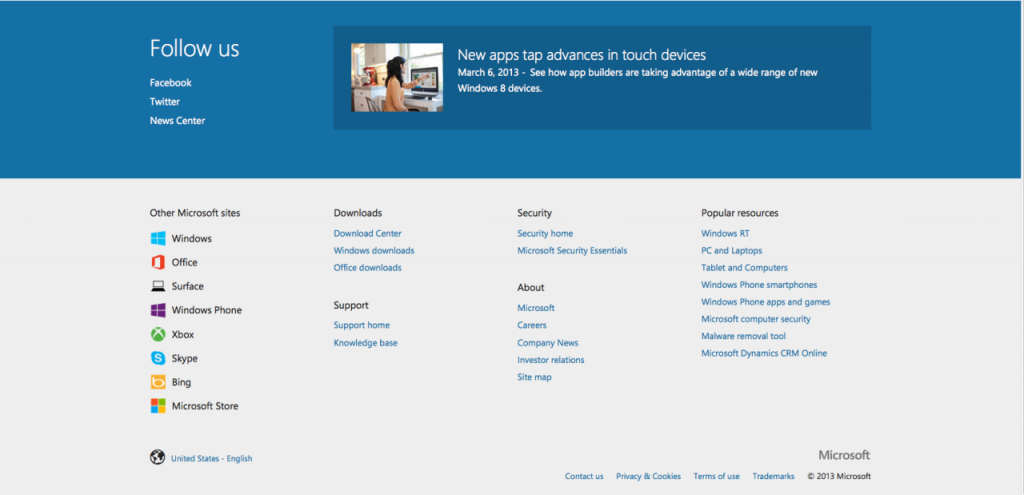
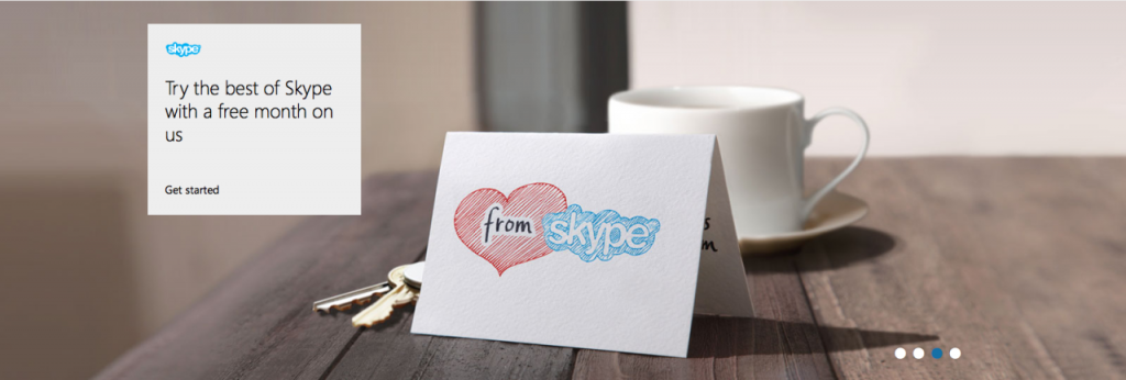
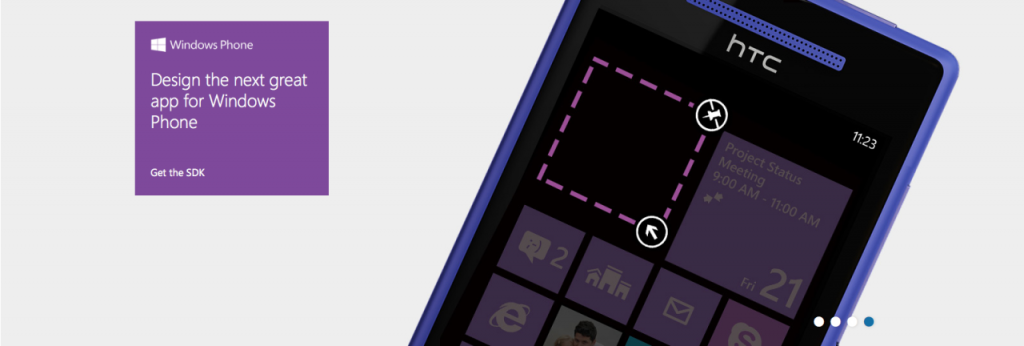
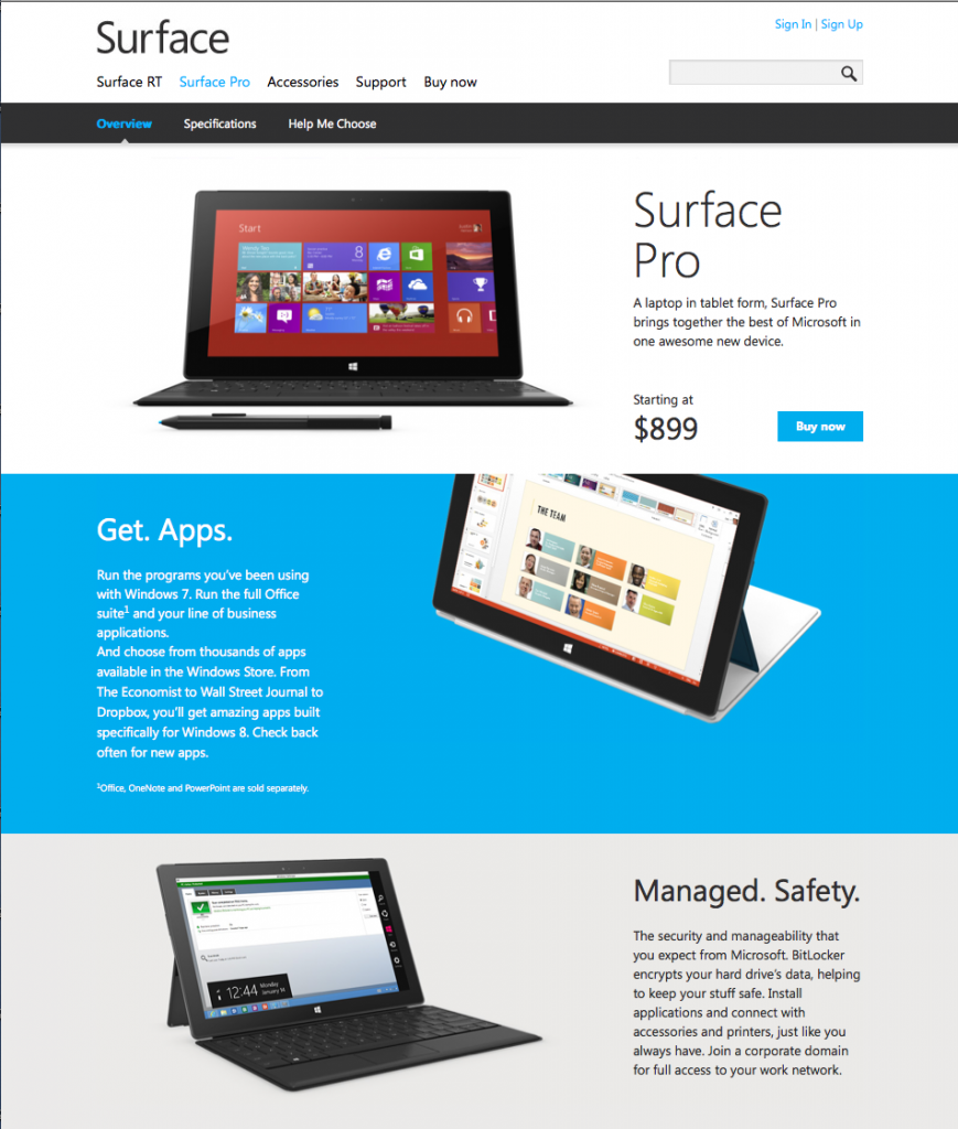
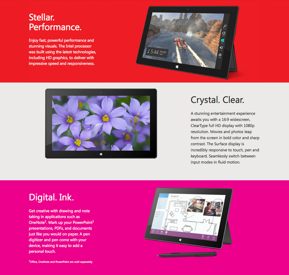
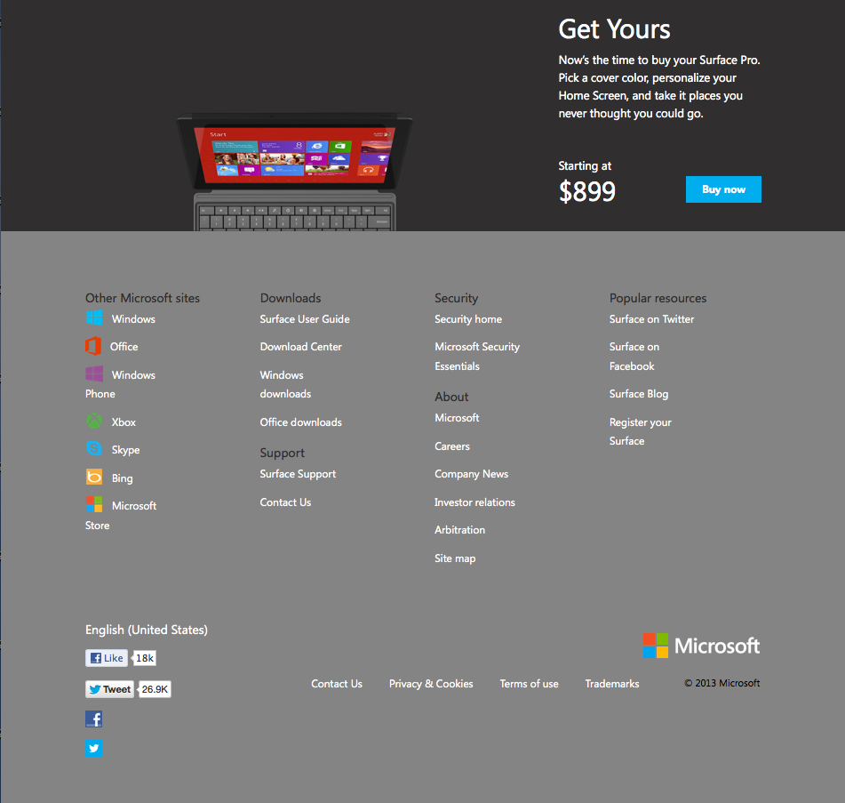
Microsoft: more design forward than Apple?!? It all started back in early 2012, with a new Windows 8 logo designed by Pentagram’s Paula Scher, quickly followed by a revised corporate identity (allegedly done in-house). Then came the launch of both the Windows-powered Lumia smartphone and the tablet, Surface, featuring the bright-colored tile interface and followed by a barrage of technicolor almost-cool advertising. Granted, a much needed refresh. The most recent relaunch of the company’s website extends the new identity with the energetic flat colors (gone are the all-too dated 3D graphics/flourishes), light sans serif usage and gridded user interface elements along with a extraordinarily pared-down, responsive design. We applaud Microsoft for being the first mega technology company to hop on the responsive bandwagon. And while the site is a bit vanilla for our tastes, it certainly is a huge step forward for the design-deprived software giant. Clean, bright and responsive — not a bad makeover for tech’s dowager countess…


