Major rebrand to reflect future vision and growth
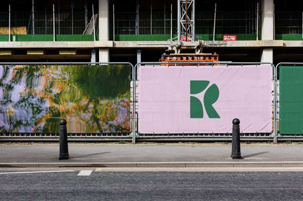
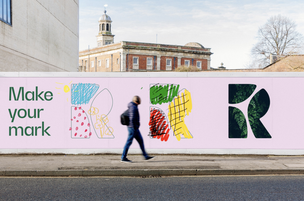
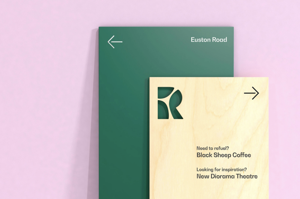
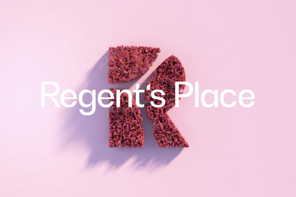
New identity for Regent’s Place, a mixed use business, retail and residential quarter (from 2010) on the north side of Euston Road in the London Borough of Camden. The new symbol represents the three districts — the Knowledge Quarter, Camden and the West End. The new identity, designed by London-base DixonBaxi, looks to capture the area’s future of housing with green space, a deeply rooted sense of community and forward-thinking, sustainable architecture. This contrasts greatly with Regent’s Place’s previous cold corporate identity. The new word mark deploys Bw Gradual for a more elegant and organic feel. The new system brings a new contemporary point-of-view reflecting the brands creative and green ethos. Animation along with reclaimed wood signage, bamboo business cards and soy-based community printing are featured to support the new approach. The entire effort is a huge step forward advancing a more progressive image for this important London neighborhood. We’re sure that it will be embraced by many businesses and residents with open arms. We salute the smart, creative and large scale effort…


