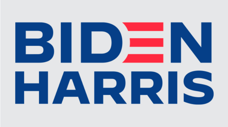
Introducing Biden-Harris
The suspense is finally over. Kamala Harris is Joe Biden’s pick as his running mate. The Democratic ticket officially has a vice president candidate. And of course, a new campaign logo. An in-house team designed the new logo which is an evolution of the Biden logo deployed for the primaries. The new Biden-Harris logo uses the typeface Decimal (Biden’s original logo used the typeface Brother 1816), developed for the campaign by type foundry Hoefler & Co. Decimal, inspired by the typography of vintage watches and clocks, feels simultaneously timeless and forward-looking. It does a good job projecting strength, honesty, dependability and accessibility. Our thoughts are somewhat mixed. On one side, the mark does present a strong sense of partnership—a unified front against the current administration. It does lack any really strong brand message which most would consider a missed opportunity. Perhaps the country wants or needs a straight-forward approach. Let’s see what is in store for the Democratic ticket with critical messaging, advertising and social media. Admittedly, most of our NYC fingers are crossed.


