Another fashion brand refresh
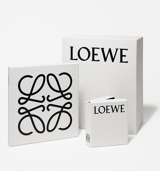
Following a new design direction for its stores led by Peter Marino and the appointment of London-based designer Jonathan Anderson as creative director, Loewe, the Spanish leather goods brand has introduced its new brand identity (to debut with the upcoming menswear collection). M/M (Paris), who have worked closely with Anderson since he took up the reins at Loewe, also remodeled the brand’s Anagram (informally known as ‘el cangrejo’, or ‘the crab’), a quadruple-L insignia designed in 1970 by Spanish artist Vicente Vela. The original logotype, set in a version of the Bembo font, has been re-designed by the Parisian pair in a typeface inspired by German-born typographer and calligrapher Berthold Wolpe. Looking at the history of the brand, the designers found that the trajectory of Wolpe (who was born near Frankfurt and emigrated to Britain in 1935) echoed that of Enrique Loewe Roessberg, the German-born craftsman whose name came to identify a cooperative of Spanish leather artisans in the mid-19th century. The new identity will be applied in black on boxes, bags and envelopes produced in a distinctive smokey white called Humo (Spanish for smoke) created specifically for the rebranding, a strong contrast with the more nostalgic shades of beige and brown that defined Loewe until now. Loewe’s new face certainly helps it ready its brand turnaround. merges the brand’s quintessential Spanish tradition with its contemporary vision. Designed to be at the same time current and long lasting, it’s a fitting new face to project Loewe into the future. A campaign shot by Steven Meisel will lead the official relaunch for the fall. Everyone think luxurious leather…


