Welcome Uniqlo
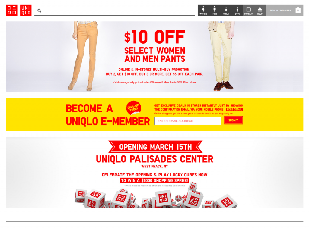
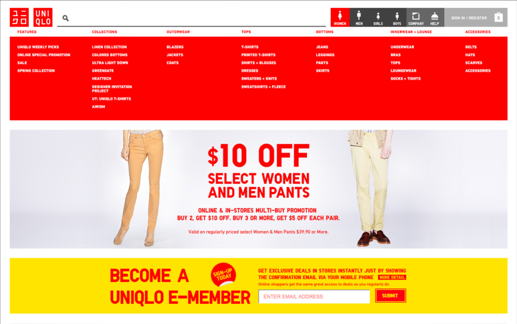
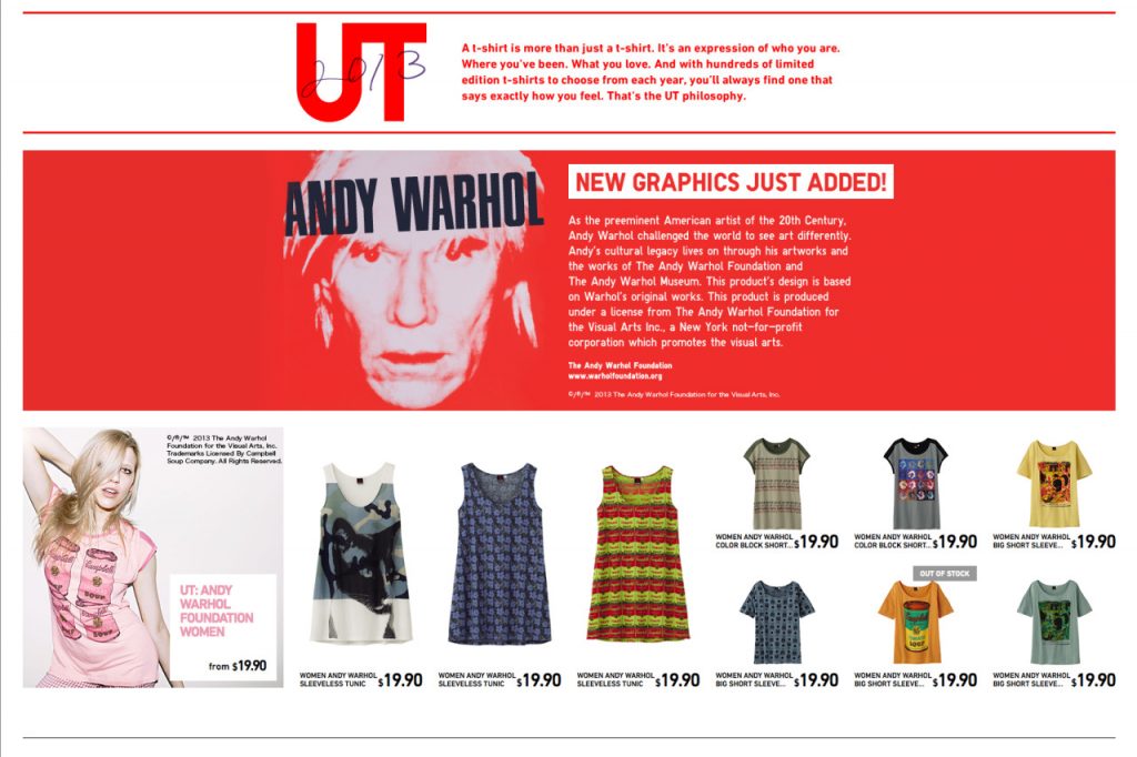
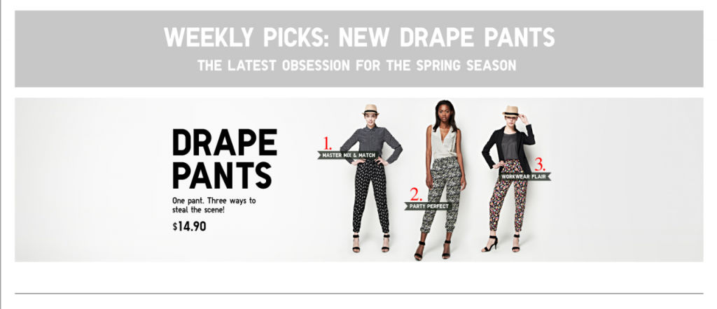
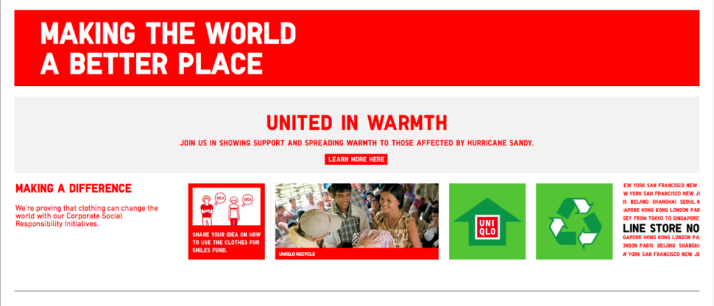
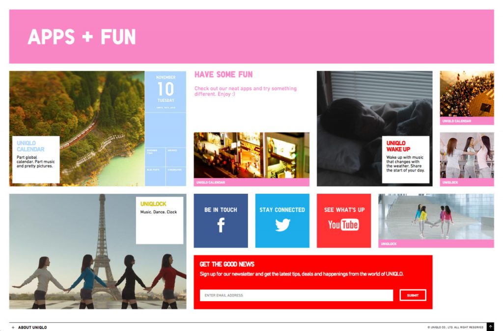
Uniqlo, the Japanese clothing giant, has always held both innovation and design as core components of its brand identity. The launch of the U.S. site last fall pushes its affordable, yet stylish minimalism with a healthy dose of the latest in dynamic and responsive site design out into the very competitive mass market apparel industry. The new site is structured more like a Tumblr blog vs. your typical apparel or retail site. The catalog or magazine-influenced layouts that have dominated the retail category are nowhere to be found with a long scrolling homepage, highlighting both the latest promotional efforts, as well as regular site features. Graphics and copy are bold and pared down, allowing easy movement from the desktop computer to tablets and smartphones. It all looks and smells like the next generation of online mass marketing to us…

